Wednesday, 15 March 2017

Organisation

Song List For Digpak.
 
 
Funeral
4:04
What Happened To Perfect
3:56
Mama Said
3:26
You're Not There
3:22
Don't You Worry 'Bout Me
3:10
Drunk In The Morning
3:23
Better Than Yourself (Criminal Mind Pt. 2)
4:26
Strip No More
3:26
Happy Home
3:38
7 Years
3:57
 
 
As you can see the song I based my music video around is called 7 Years. This is a song featured on the album and I have named it that because I felt Lucas Graham had a physically and emotion connection with this song.

Tuesday, 14 March 2017

Organisation

This is a still from my music video which was shot a couple of moths ago. As you can see its an over the shoulder shot from the child looking up to the 'Abusive, Alcoholic Father.' I showed my teacher the latest update of the music video and unfortunately, I have to cut the dad raising him arm up to the child out. Due to the Child Abusive Connation's it held, The exam board may believe it is not suitable there I had to remove this bit from my music video.

Monday, 13 March 2017

Research Into Similar Products

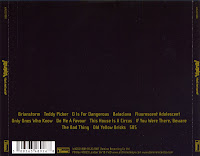
Image result for lukas graham logoConventions of Digipak


Artist name
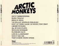
Song list 
price 
barcode
spine
Image result for album covers arctic monkeysrecord labels 
name of album
photography 
Image result for album covers arctic monkeys barcode

Thursday, 9 March 2017

Research into Similar Products

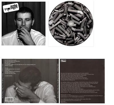
Image result for whatever people say i am that's what i'm not digipak
I have also been heavily inspired by 'The Arctic Monkeys and particularly their digipak for 'Whatever People Say I Am That's What I'm Not.' This is a interview from the man who is pictured on the front of this album and how the Arctic Monkeys got him to take the shots. (https://www.theguardian.com/artanddesign/2016/apr/22/arctic-monkeys-chris-mclure-poses-cover-debut-album-2006)    My idea is very similar to this and the overall digipak is simple yet effective

Wednesday, 8 March 2017

Drafting and Planning

Although the genre that 'Frank Ocean' portrays is one of rap and hip hop I have been heavily influenced by his work. As you can see this is a album cover for his new album 'Blond.' It features a very plain background and a photo of the artist with the album name on the front. As said in the blog posted on 28th February mine is going to be very similar.I will post a photo very soon of my progress regarding my digipak. 

Monday, 6 March 2017

Organisation

Related imageAs mentioned in the blog post featured (Blog Explaining Problems ) I was having some serious problems with my editing software, MoviePlusX6. I have overcome this problem with some advice I read from a professional online. He has explaining how to edit with Proxy Files turned off allowing the film to now be smooth and not look armature. I believe because I now have a smooth video I can start work on  my auxiliary products of Digipak and magazine advert. I hope that the overall product will achieve high marks.

Thursday, 2 March 2017

Drafting and Planning

As said in previous blog post I am going to explaining the idea for my digipak back.  My front cover features a picture of my artists therefore my back is going to show a glimpse of my video. I am going to feature the 'abusive father' with the whiskey shown in the video and him passed out. This shows how lost he is without the son from the video. I will include red text to show a connection with the front of the digipak which will also stand out against the background. I will also use the stereotypical codes and conventions like the record company and bar code to make it look profession. I think this is a very good idea and will fit the indie genre well.

Wednesday, 1 March 2017

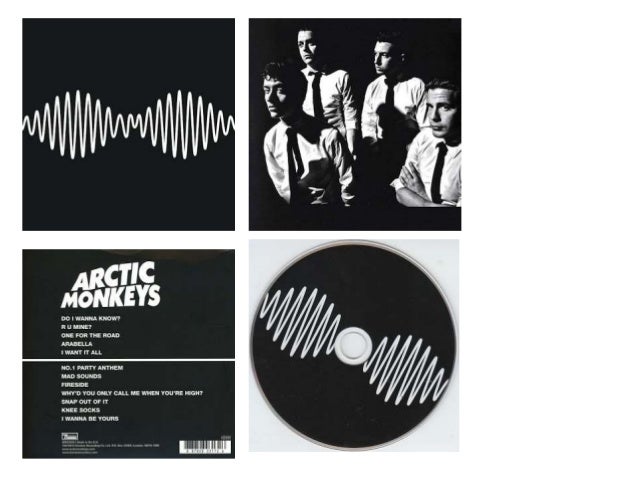
Drafting and Planning

Image result for digipaks amI have started to plan my Digipak ideas. As my artist features in my music video I am going to include him on the magazine. For the front I will have a red background with the stereotypical Lucas Graham logo on it. It will then feature of picture of the 'band' on the front cover who will fit the indie genre well, I will include stereotypical indie genre conventions such as he indie clothing 'Thrasher' and Smoking. I will include photos of this shoot in further blog posts and have been heavily inspired by the Arctic Monkeys AM album therefore the pictures will be in black and white to contrast the red background. This is my idea for the front cover of my digipak.